This new start-up airline was looking to create an online experience that was fast, easy and intuitive, based on a deep understanding of their target users.
The airline industry is packed full of bad design and is a space that cleary needs UX.
User’s have a wealth of tools they can use to search and book travel, however this variety creates confusion and ambiguity when trying to to secure the perfect flight.
Design a mobile app for Fly UX that provides a smooth user experience for searching and booking flights.
Truely understanding our users is imperative to good design. Putting myself in their shoes through competitive benchmarking was the ideal place to start.
Reviewing four competitor apps – British Airways, EasyJet, Singapore Airlines and Kayak – my objectives were to:
Each page of the app was reviewed against the following criteria:
Building on the findings from the Competitive Benchmark, I designed a short online survey to further understand users’ experience of the flight booking process.
32%
Book flights
30%
Check-in
16%
Manage
Bookings
12%
Get boarding
passes
“I was looking for a flight at a reasonabe price on a specific date”
“I don’t like all the upselling. I’m always anxious that I have accidentally added a rental car.”
A deeper understanding of our users experience was gained through Usability Tests with competitor apps, and delivered a rich source of qualitative data that would feed into the development of the Fly UX app.
An affinity diagram session was a practical and effective way to make sense of the vast raw data collected from the research.
Running a successful affinity diagram session required simple yet deliberate presentation of research outputs to those participating.
For this project, I employed one other household member to review all the research, and write down notes/observations as we progressed.
These notes were that put up on a wall, and we began the process of clustering – grouping similar notes together.
Starting this process in silence, we would begin to open the converstation as we refined some of the bigger groups into more granular detail.
Final groupings where given a title. These groups and their titles reflected what the data was telling us, and clear themes and issues came up.
For presentation purposes and distributoin with others, I created a digital version.
The outputs from the affinity diagram allow us to translate chaotic research data into a structured document – the Customer Jounrey Map (CJM) – and was the perfect tool for summarising the goals of our users and their experiences.
My CJM for Fly UX began with pen and paper, using the high level groupings from the affinity diagram to establish the high-level steps within the customer journey.
Under each step, observations were classified under User Goals, Behaviours, Pain Points and Positives.
The CJM was brought to life by assessing how positive each step of the journey was, enriched with direct quotes from users.
It’s clear to see from the customer journey map that user’s enjoy the initial planning and search process. however, as they proceed with more information and decisions to be made, the experience stagnates.
My goal as UX Designer is to focus on these pain points by developing concise screens that present clear and transparent information.
Focussing on one primary use case, a high-level user flow was established with consideration to the issues highlighted in the Customer Journey Map.
Each screen and screen state were included along with user decisions. Streamlining this journey was key. Many iterations of the flow were made, always asking myself how I could take the user through their journey with as little friction as possible.
This flow diagram was created using Figma.
Putting pen to paper and bringing the Flow Diagram to life. Each screen designed with consideration to how the user would navigate and interact with it.
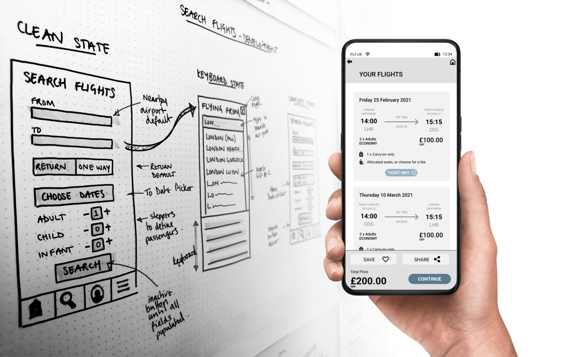
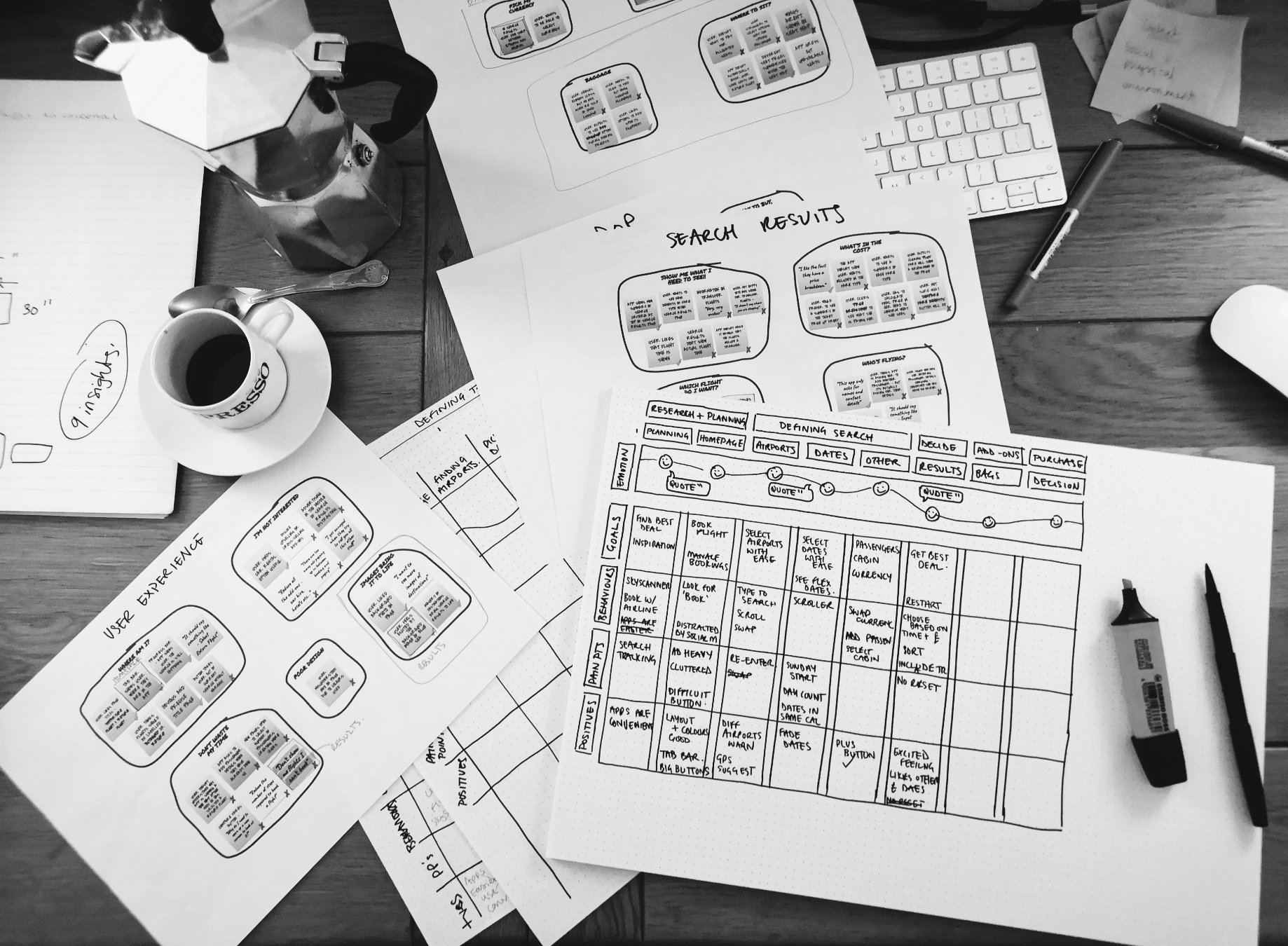
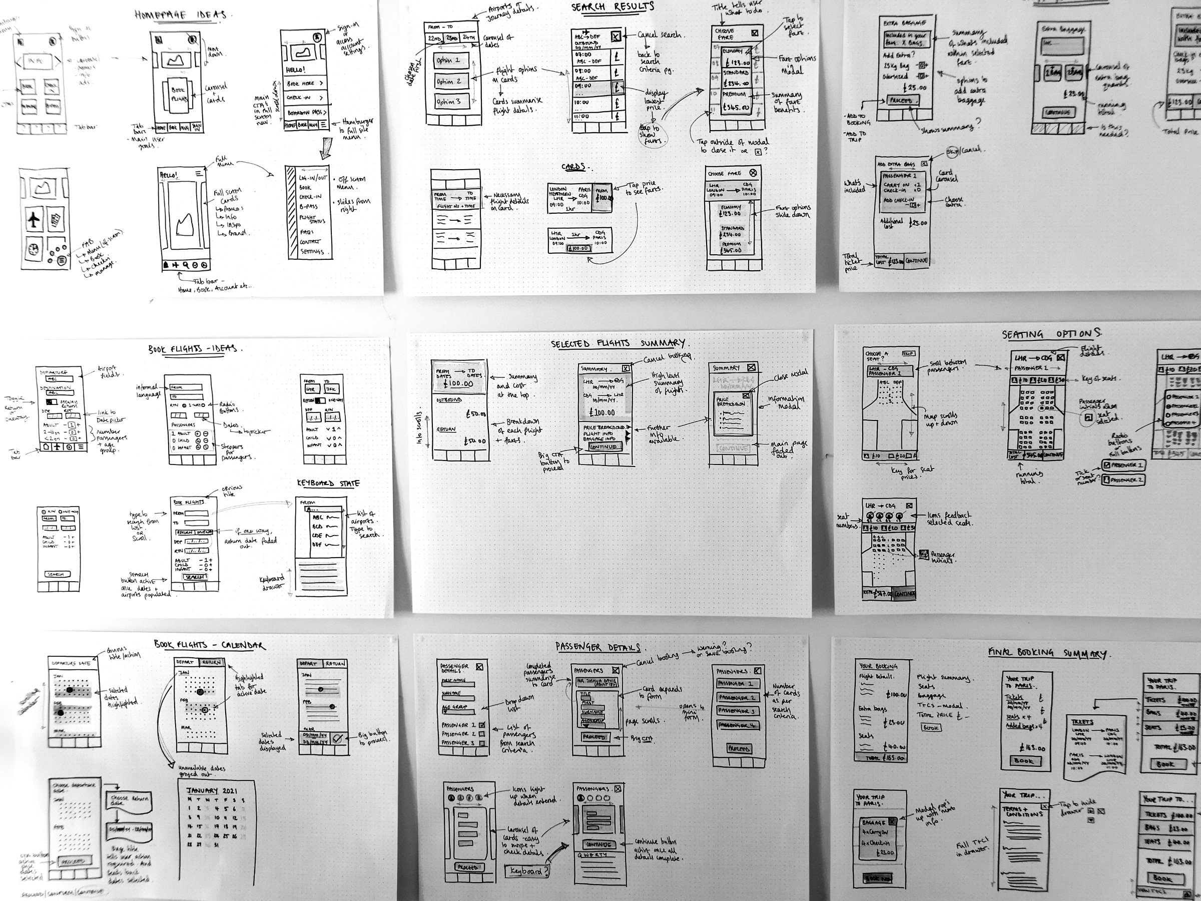
Quick sketches of page layouts and funcationality.
How much info do I display?
What do I prioritise?
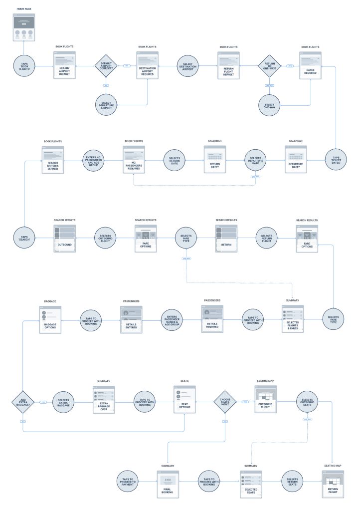
Is it easy for users to progress?
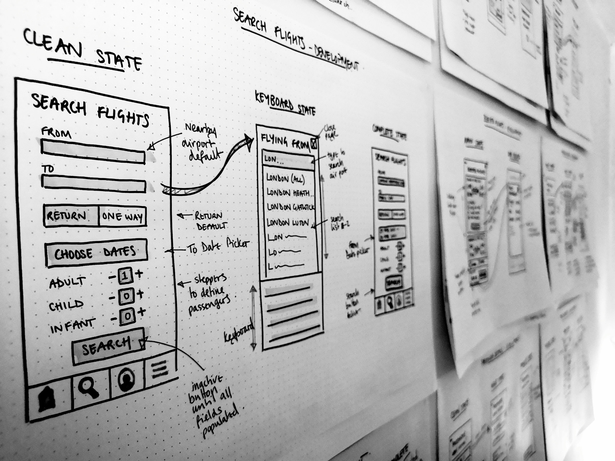
Taking initial ideas and developing them further, considering more details interactions.
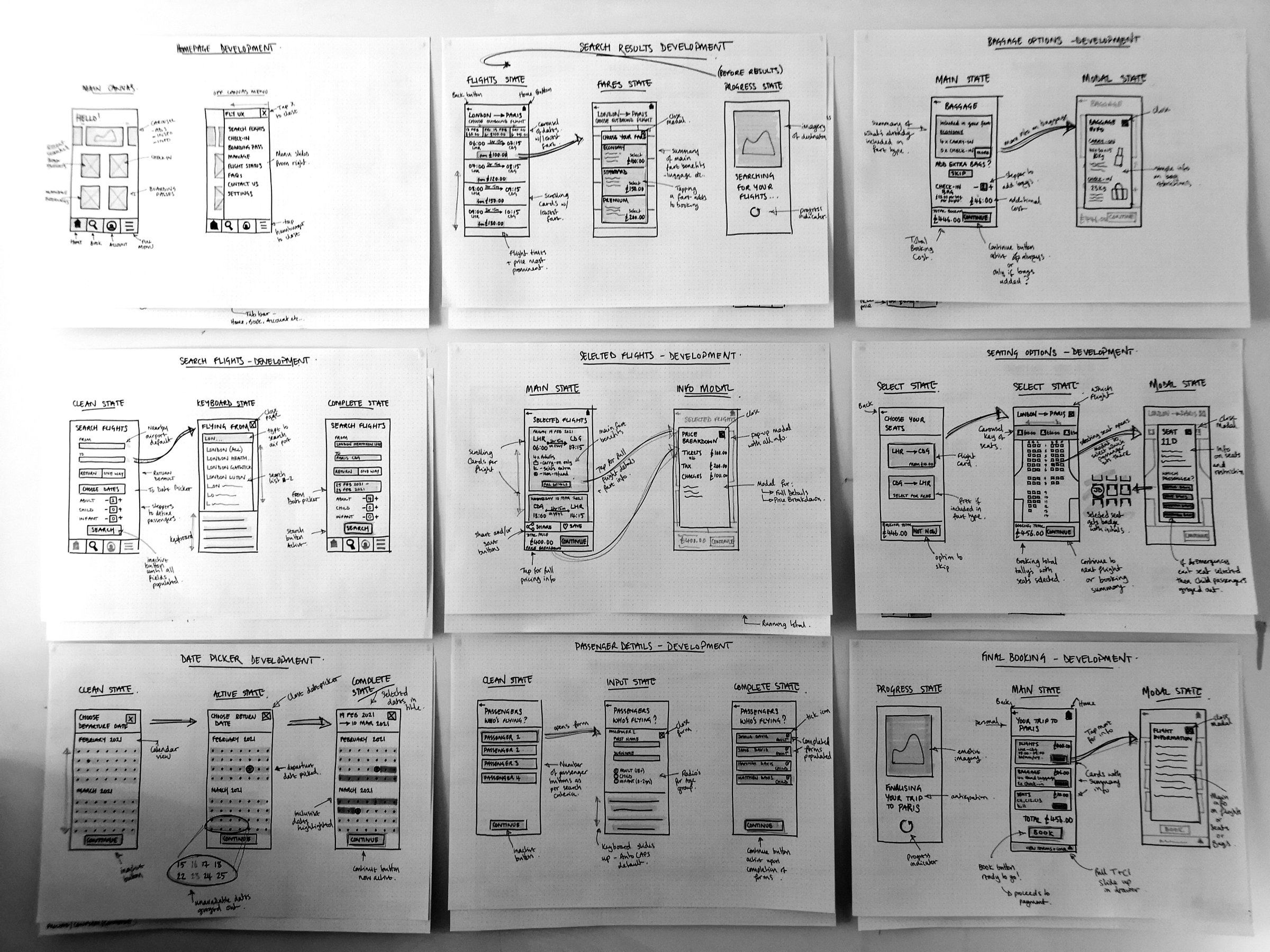
Lo-Fi designs ready to be digitised and interaction added. These sketches would help me talk about my ideas and be the starting point for my prototype.
Using Figma, I began to build out each screen and screen state, referencing the user flow as I progressed.
Lorem ipsum dolor sit amet, consectetur adipiscing elit, sed do eiusmod tempor incididunt ut labore et dolore magna aliqua. Ut enim ad minim veniam, quis nostrud exercitation ullamco laboris nisi ut aliquip ex ea commodo consequat. Duis aute irure dolor in reprehenderit in voluptate velit esse cillum dolore eu fugiat nulla pariatur. Excepteur sint occaecat cupidatat non proident, sunt in culpa qui officia deserunt mollit anim id est laborum.
To complete the project and get the design ready for hand-off, I drew up a comprehensive set of detailed wireframes. These would be accompanied with the working prototype and sser flow diagram, and discussed in a face-to-face meeting with the developer taking on the project.
Lorem ipsum dolor sit amet, consectetur adipiscing elit, sed do eiusmod tempor incididunt ut labore et dolore magna aliqua. Ut enim ad minim veniam, quis nostrud exercitation ullamco laboris nisi ut aliquip ex ea commodo consequat. Duis aute irure dolor in reprehenderit in voluptate velit esse cillum dolore eu fugiat nulla pariatur. Excepteur sint occaecat cupidatat non proident, sunt in culpa qui officia deserunt mollit anim id est laborum.